
I have posted a few times about the software I use to train. One of the major pieces of software I use is Golden Cheetah. This free piece of software has been a key part of my every day analysis. Below, I’m going to show you what I do for triathlon training with Golden Cheetah. Keep in mind I’ve been using the development build version of this app for quite some time. It’s usually quite stable, but occasionally runs into glitches. As of this writing, I am using build number 1708. Read on for more.
Overview
Golden Cheetah is a free piece of software built from people who believe that the data our smart devices record should be freed from their manufacturers. Own a Garmin, Polar, Power Tap, etc.? The developers wanted to make sure you could access all the data, power, and latest exercise science surrounding the information these devices produce. This application is available for Windows, Mac, and Linux. There is no cloud version available so it must be installed on your local machine similar to TrainingPeaks WKO4.
There are easy ways to synchronize this application so that the data can be used across several computers. I have my athlete data on Dropbox. Every time I load workouts, add charts, etc. it is published to my Dropbox and is then also available to another computer I have. Note, there are no mobile apps that can read this data yet.
Activities
The first part of my analysis comes after I complete a workout. Golden Cheetah has an integration with several cloud vendors including Google Drive, Dropbox, and Strava. In my case, as I publish all my activities to Strava, it’s a simple import and sync from Strava to Golden Cheetah. Once the activity synchronizes from Strava, it is now available in the application.
The application allows for nearly infinite customization including addition of pre-built charts, dashboards, or enabling you to create custom charts and metrics. In my case, I downloaded one of the dashboards which are under active development. This is my first view. It gives a snapshot of the activity. While the dashboards are under active development, it does give a nice snapshot of your day. One thing I did note, is that the top left tile showing form and fitness appears to only grab “bike” specific form and fitness and doesn’t use the triathlon specific calculation. More on that later.

After the dashboard screen, I have a summary screen. This shows me the key snapshot of the activity. It shows calories, distance, time, averages, etc. It also shows time spent in certain training zones, which I find helpful. Did I hit my desired target zones? I also like how at the bottom it shows an overview of the “best” efforts over a given duration such as power, cadence, and speed for a 10 second snapshot up to a few hours.

Next, I have a screen where I can enter tags for my workout (such as Long, VO2 Max, Threshold, Brick, etc.). I have Golden Cheetah setup to automatically color my activities based on these tags. You can also add text inputs such as objective or notes.

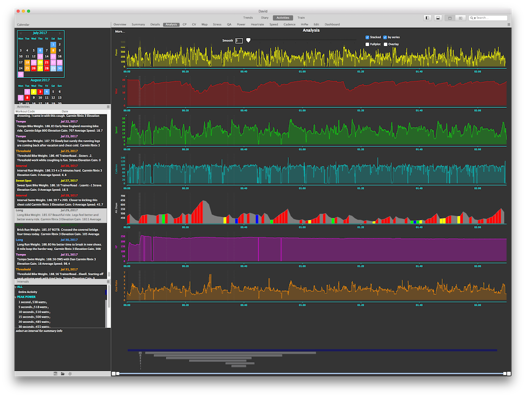
The analysis screen is where a lot of the power of Golden Cheetah lives. You can add custom metrics or tweak this screen to your liking. For me, I like seeing a lot of the data overlaid. One thing I’ve setup is showing both normalized power and gear ratios for rides. This show me how consistent my normalized power was during a ride and helps me understand if I faded or was strong. The gear ratio helps me see where I needed to stand up. If my workout purpose was to stay in aero as long as possible, but I needed to stand, it might indicate I was fatigued and couldn’t hold the power I needed. This is more obvious when I train indoors.

The power curve is a staple among cyclists who train with power. This is super helpful to not only see how your ride compares to your best efforts, but also helps you see in a graph the type of ride you did. If you are attempting something like 2 x 20 at threshold, you wouldn’t expect to see high power output on the short time period. But if you are doing 30 x 30 second all outs, you would. Golden Cheetah shows you how this ride matches to your best power curve. For me, I like to focus on the over 20 minute section as it helps me track how I’m improving.
This screen will also allow you to dive into specific intervals and even compare like intervals together. You could easily see how both 2 x 20 efforts compared and overlay them on each other. Did you fade on the second one or did you hold back on the first one making the second better? How did your 30 x 30 go?

There is also mapping capability built in. One cool feature is the map can be shaded to show relative fast and slow sections of the activity. This is helpful to show where the hills might be, where you let up to get some nutrition in, etc.

Golden Cheetah also shows a metric called W’ (W prime). Put simply, W’ is the amount of “matches” you burned. You start with a full set of matches and start burning them as you ride. See, your body only has enough energy in it to ride at a given threshold for a given period of time. Ever wonder why you feel like you can ride in Power Zone 1 all day but if you do a 30 x 30 second all out, you are ready to die? This is why. So this chart shows you how you are burning down to zero over the course of your ride. In the below chart, red is W’ and yellow is actual power in watts. As you ease off the gas, eat, and recover, your W’ can recover as well. It’s pretty interesting to see how this works and then match it up later. I’ve had several rides where I come back to this chart and match where I felt like trash to the W’ chart. Low and behold I was at zero or negative W’. I went out too hard or pushed too hard.

I’ve also got a chart for quadrant analysis. I like to see this as a distribution of power in watts matched to cadance. Everyone always says ride at 90+ rpm, but for me and my riding style, is it truly the most optimal cadence? For me I’ve found that my optimal cadence is actually around 87-88 (much like my running cadence). Maybe there’s something there…

Another cool chart plots your power in a histogram and overlays it with your power zones. This is cool because it shows you the overall distribution in zones for this specific ride. I don’t know about you, but sometimes you just don’t have a great day on the bike and you miss the target power on your workout. But then you might come in here and realize that you didn’t miss it by that much. Or other days you realize you felt great and might have shifted the entire ride into a different zone…oops.

Much like power distribution, there is a chart for speed distribution. I find this helpful when I look to see how consistent my speed is on a given course. The more hilly the more variability you’ll find here. The flatter the terrain or steady effort on a trainer, the more you’d want this to be more consistent.

Here is another distribution chart, but this time it’s for cadence. I like to see this just from a consistency standpoint.

Trends
The power of Golden Cheetah has already been established on the activity analysis side. Similarly, there is significant trend analysis capability built in. The first thing that I did was create my season within the application. This allows you to specify given races, major training events, etc. and see how your performance, fatigue, and fitness have been trending into those events. You’ll see what this means shortly.
The first trend screen I use shows me an overview of everything I’ve done using the filters in the top left. So I might say, show me everything from this season (2017). Then I might dive in and say, show me the last month, or this week. I also set this screen up to show me at a glance my best efforts for swimming, biking, and running on metrics I think are important to track and trend. It shorts them by best effort first. So for swimming, I care about 2, 5, and 20 minute peak pace. Am I getting better?
For swimming, not really because this year I haven’t done much of it. On biking, I track 5, 20, and 60 minute power PRs. Am I getting better? Yes. One thing this overview showed me is my outdoor power is usually significantly higher than indoor power. On running, I’m tracking the same 5, 20, and 60 minute average pacing. It’s a nice overview screen.

The next screen I have is a weekly overview showing time, distance, and weight. I don’t use this much as it has many cycling metrics I find elsewhere.
Many people are familiar with the performance management chart found in TrainingPeaks. The concept is as you train, you become fatigued. That fatigue will eventually translate into higher fitness. You want to time this fatigue and fitness properly so you simultaneously don’t overtrain (get hurt or burnout) and peak for your major events. The thing I really like about this chart is that it uses a metric called Triscore. As I’ve configured the application, it understands my threshold power and paces. Each workout gets a score (much like cycling TSS) and is plotted on this graph. I’ve also added a line for swim, bike, and run, so I can see how my training stress for each of the three disciplines is contributing to my overall fatigue and fitness. Swim, as you’d expect is not much of a factor. I’ve also configured this chart to highlight some of the peak fatigue and training days. One note here. The yellow shaded line is called training stress balance. It’s more or less the gap between your fatigue and fitness calculation. During peak weeks (and most training weeks for that matter), your fatigue is higher than fitness, thus the yellow line is negative. But for a race you wish to peak at, you want that yellow line at zero or slightly positive indicating your fitness is now higher than fatigue and you should perform well. See those vertical blue bars with red text on top? Those are the key events from my season I setup. For all charts that follow, I can see how the metrics trended into and out of those events. It’s really slick.

There is powerful modeling built into Golden Cheetah. It tries to predict your anaerobic and FTP thresholds using data loaded and keeps track of the estimated value and actual value.

As we saw on the activity screen, the trend screen aggregates all the rides you have completed within the date filter specified and shows your power curve. This model is what gets dropped into your activity screen to compare a ride against. For me, this chart still shows I have a relatively high capability to produce high power for short durations. Over the last year I’ve been working hard to make my power profile more fitting for the longer sustained power necessary in triathlon. I’ve seen a 25% increase in my FTP after focusing on this in the last year.

Golden Cheetah also allows you to use “R” charts. R is a powerful third-party charting tool. Naturally, some members of the Golden Cheetah community have built charts using the data loaded and putting it into more powerful charts. This example is charting your training stress balance with intensity factor. Remember that yellow line from the performance management chart? That’s the training stress balance. The theory here is looking to see how hard you are pushing in a fatigued state. This year I’ve struggled a bit with consistency and this chart shows it. You can, however see some tough workouts mixed in.

I wrote a post recently on how I use TrainerRoad’s triathlon training plans. One key piece of their plans are higher work output in a lower time duration. Most of this training includes some Z3 longer efforts and many intervals in higher zones. This view lets me see the breakdown of time spent in power zones with TSS laid on top.

The next view is a general trend for the aerobic power metrics in 10, 20, 30, 60, and 90 minute “peaks”. I don’t use this chart much as the training plan differs significantly over the course of a year, but it’s nice to see how peak efforts are trending over a longer term. This is a similar chart to the best power curve, but only trending those longer durations that you’d see as relevant in triathlon.

I call this next chart the “what did I decide to focus on this year” chart. As you can see, I had a bike focused year. I spent a lot of time working on bike fit and attempting to get my FTP to increase. My swimming took a huge back seat this year. But it’s cool to see the break down. Remember those tags that I mentioned back on the activity screen? Those come through here to see how much relative time was spent with those types of workouts.

Similar to the aerobic power chart above, I also have a chart setup for running. This is a nice overview for how my running is progressing over time. On this chart you want a trend down and to the right as the vertical axis is minutes per mile.

This next chart I think is one of the most interesting. It is a triathlon run split predictor. It uses a formula based on the VDOT calculation. Last year, this chart predicted my half marathon split at Ironman Timberman 70.3 within three minutes. It gives you an estimate for sprint, olympic, and high/low for half and full distance triathlon. It is constantly moving using your run splits you load. I’ve found it shockingly accurate.

I do have a swim metric trend but as you can see, I haven’t gone swimming much this year. I’ve also learned that this chart doesn’t work well for open water swims due to the difficulty getting accurate paces with GPS. I might remove this chart or tweak it a bit to remove open water. That said, the chart is comparing 1, 5, and 20 minute peak paces. It also plots the activity average as well.

As I mentioned in my training with technology post, I have a Withings scale. Golden Cheetah can download the data from the Withings site and log it into the app. This screen plots weight, body fat, and trends them. I also have watts per kilogram (watt/kg) overlaid. The only downside of this calculation is that it compares your average watts for a loaded ride to the loaded weight. So it is a mere game of averages, but is nice to see the trends.

Lastly on the trend chart, I have the 20 minute power best overlaid on my power zone chart. It’s an interesting view for roughly how hard on average that ride was.

Training Mode
I’ve written about and preached why I love TrainerRoad for my training. It’s reasonable, gives you access to training plans. Really, just read my post about it. But, some people might have coaches that prescribe specific indoor training or don’t want to use an app like TrainerRoad or Zwift. Golden Cheetah lets you easily build a custom workout or load some from the ERGdb. All you’d need to do is pop in an ANT+ stick and pair your power meter to the app. But, still, the capability exists. I’m hoping at some point to figure out a way (or hope the developers add) this capability for treadmills using the running pods or run power meters.

Summary
For a free app the capability of this software is astounding. The biggest problem this app has is that it does have a sizable learning curve. It can be tough to set up and the UI isn’t the greatest, but the developers know this and are working on improving it this year. Another major feature they are looking to add is ability to plan workouts. This could be a huge feature and take some advantage away from TrainingPeaks.
If you are looking for something new, aren’t happy with your current software, or are a bit of a data junkie and techie, give this a shot.